Sanctuary
Wellness.
Two Concepts.
Two homepage directions for review. Same brand, same content, different feel. Open each and decide what's right for the launch.
Two homepage directions for review. Same brand, same content, different feel. Open each and decide what's right for the launch.
Click either card to open the full page. Both use real assets and are mobile responsive.
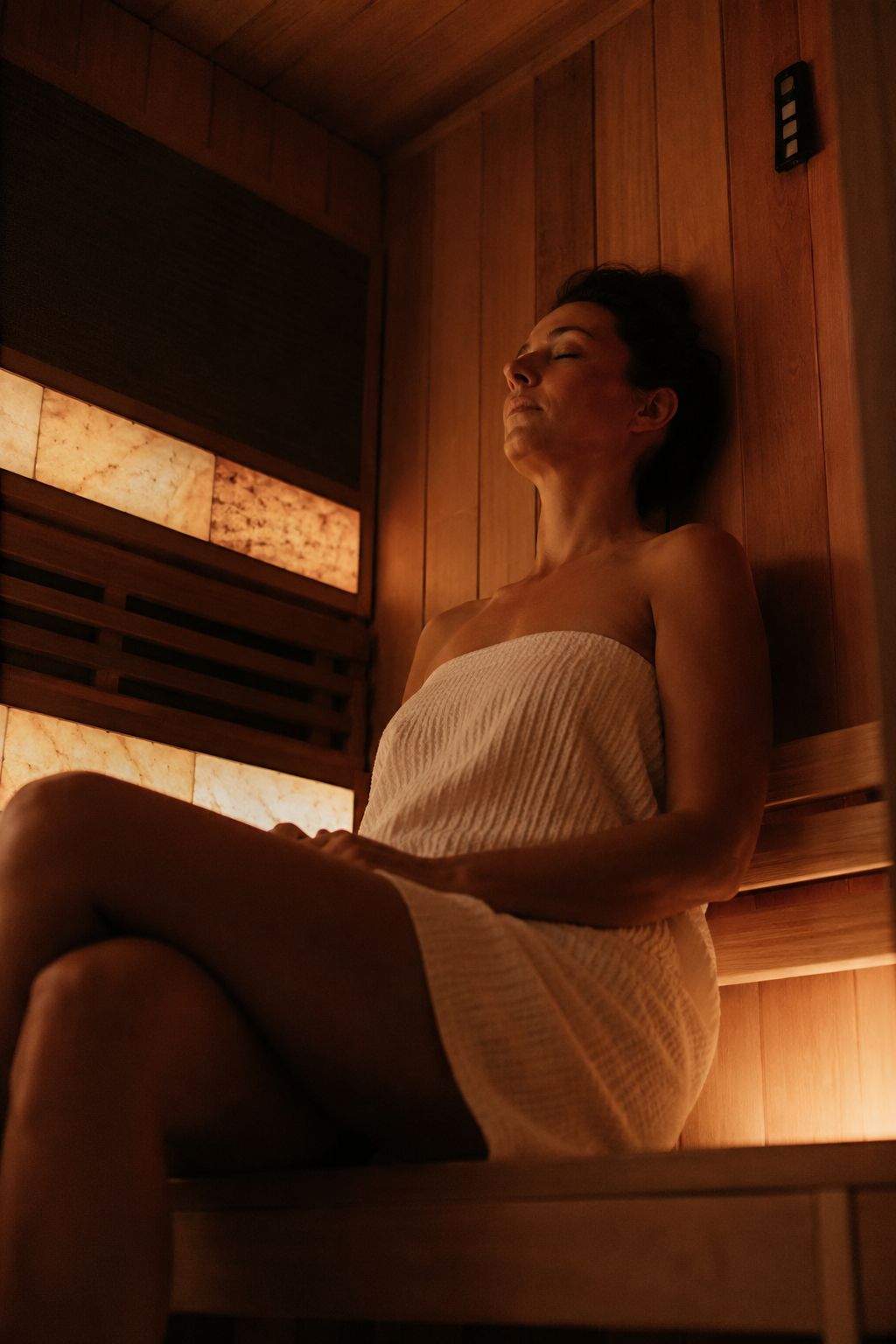 Version 1
Image-led service cards in a clean grid. Strong typographic hierarchy. A familiar premium layout, approachable, easy to scan, lets the photography lead.
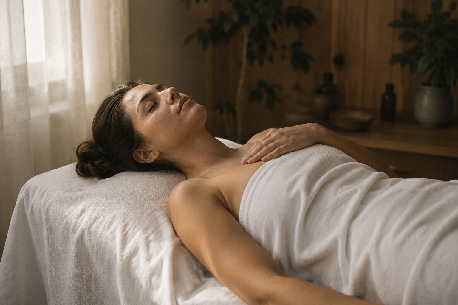 Version 2
Hexagonal service grid with video hero. A visual identity no competitor on the Kapiti Coast has. Signals premium recovery, not just another wellness studio.
Each concept uses its own typographic and colour system. Shared logo, shared voice.
 Quiet confidence, never shoutsFactual about benefits, poetic in deliveryShort sentences. Space to breathe.No wellness clichés or spa languageKapiti-rooted, nationally aspirationalSpeaks to high-performers and recovery-aware clients
The full-width island silhouette closes every page. It places Sanctuary Wellness on the Kapiti Coast without a single word.
Subtle slogan overlay for light sections. Adds brand texture without competing with primary content.
The Sanctuary Wellness brand symbol. Used as an icon mark throughout the pages: section markers, dividers, and alongside headings.
A short drive from Wellington. A world away from the noise.